Today we have Maury, from A Fabuless Home! I've been following her blog since her second, maybe third post. And I love everything she has done! Let's welcome Maury!
I am so excited to be the first guest blogger in Christy’s new series! I’ve been a fan of Christy’s blog for a while. She has such enviable sewing and crafting skills!
Do you ever feel like a house has feelings? My husband and I just bought a new house. I could see the potential in each room, but during that first walk-through, the house just felt SAD. The interior was so dark! The kitchen and family rooms boasts two windows… COMBINED! So today, I’m sharing with you the 7 TIPS I’ve learned about bringing light into otherwise gloomy spaces (without adding windows).
TIP 1: TAKE OUT UNNECESSARY LIGHT-BLOCKING PIECES.

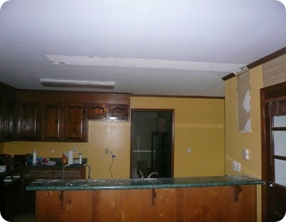
These cabinets offered good storage, but that was about their only redeeming factor. They were dark and closed off the room, so down they came. Simply freeing up visual space can make a room feel bigger and brighter (even if its still ugly).

TIP 2: LIGHTEN UP MAJOR FOCAL POINTS
If the biggest focal points in your room are bright, then you eyes are drawn to them and you don’t notice the lack of natural light.

In our case we had dark trim, a dark brick fireplace and dark cabinets dividing the kitchen from the family room.
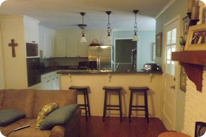
We painted the fireplace and the kitchen cabinets. I know, I know… it’s practically sacrilegious to encourage people to paint brick and wood (especially in the same sentence), but in this space it was necessary. They were by far the biggest light voids in these rooms. Now when you walk into the room your eyes are drawn to the lightest and brightest items, not the darkest. This is the same shot as above taken around the same time of day:

TIP 3: PAINT
There are a myriad of “neutral” colors that still hold color… you don’t have to go with white, ivory or yellow. In fact, the kitchen was painted yellow and it didn’t help to bright it at all. It only succeeded in highlighting the darkness of the cabinets and the hideousness of the counter tops.

Yep, that’s the same picture as above, but I was including it so that you don’t have to scroll up and down. Isn’t that just the kind of thoughtfulness that makes you want to visit my blog?

I painted every single surface in both rooms, except for the floors and the counter tops. Since I couldn’t get rid of the counter tops (YET!), I choose a color the complimented the counter tops and helped make them disappear into the background.
TIP 4: DON’T BLOCK THE LIGHT!
It drives me crazy when I see a room that has tons of windows and beautiful natural light and the curtains and blinds are blocking it all.
Curtains: use curtains to enhance the windows and draw your eye to them. my curtain rods are hung so that I can push the curtains to either side of the window without blocking any light.

The area in front of the window desperately needed some interest, but I didn’t want to block the window itself. I chose a short chair and a tall floor lamp. The shade is actually blocking the window just slightly but it’s mostly positioned in front of the bookcase. Additionally, it’s a pale color so that it reflects the light from the window.
TIP 5: MIRRORS!

If you have a room with few windows, a mirror on the wall opposing the windows can be a huge help. It reflects the natural light back into the room. Please excuse the balled up blanket on the couch. I’m going for the “lived in” look.
TIP 6: LIGHTS, DUH!
I know it sounds really obvious, but proper lighting is key. Correct lighting brings warmth and character to a room. I don’t have this one complete yet. I desperately need some under-the-counter lights in the kitchen and I’d love to wire the built-in for lights as well. However, we added the pendants, the ceiling fan, and two lamps to the room.

We’ve got a ways to go yet, but at least the kitchen and the family room feel like home. As far as feelings go, the house has probably moved from sad and dreary to content. We’re working on the happy home we dreamed of! I hope you’ll join us for the ride!

Thanks again, Christy, for letting kick-off this series! I can’t wait to see the great bloggers that you bring over the next few months.
WOW! It looks great Maury! I'm so glad you decided to share that with us. Makes me want to go re-do my kitchen. HA! Please take a moment and stop by A Fabuless Home and look at all of the other wonderful things she has been working on....and give her a follow. :)


I love Maury's blog! And I absolutely can't get over the major changes she's achieved in her kitchen and family room. What a difference!
ReplyDelete